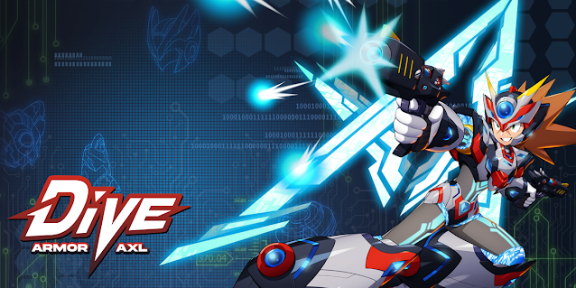
Capcom Japan took to social media once again to show players the creative process behind the newest DiVE Armor character design. Unfortantely, it's a very short interview with Keisuke Mizuno... and neither Capcom Japan or Capcom Taiwan shared any concept art.
Mini-interview with Capcom designer Mizuno Keisuke on the Axl DiVE Armor
Tell us about the characteristics of the overall structure.
The back of the head has not changed, but the headgear is represented in a big way, reinforced and upgraded by the horns. As with the previous "Zero DiVE Armor," I first considered "what to emphasize and keep as Axl's iconic parts."
There's his hair, of course, but also the facial scars and the silhouette of the helmet, as well as the projection-like shape protruding from the ears to the top that is considered important. Other than these, I decided that I could make some drastic changes and still keep Axl's coolness.
The chest has also changed.
A2: It has also been adapted to the original "armor" design. Like the "Zero DiVE Armor," it has been drastically changed.
However, I believe that the iconic part of Axl is the headgear, so I changed the shape of the headgear from the "armor" and kept the iconic Axl while expressing a cool new Axl!
If you look closely at the design of the gun Axl is holding, it also looks like it has been changed from the original.
A3: Yes, in fact, the colors have been slightly changed from the original to match the DiVE armor! The color is blackish chic, but I have added contrasting yellow and red to match the armor so as not to detract from its sense of presence.
Many thanks to Windii Gitlord for the interview translation!


Thanks for the translation! Aw, what a shame it's so short; I like that Mizuno went and actively tried to change things up a bit with the design while keeping in mind to still keep the most recognizable elements of characters, but I've would liked to see the concept art, and what inspired the set of blue "eyes" in the helmet....
ReplyDelete